Today I have been experimenting and printing off copious amounts of patterns and clothing from the American Apparel range as well as trying to organize two shoots within the next two weeks. I tried booking a studio for Thursday morning (an arranged time that my photographer and model can do) but was told that the list was booked up until January, which means I will rent out a lighting kit and have to do the shoot at home. This doesn't pose too many problems except for space. I can do the shoot in my living room if I move the furniture and also I will get the added bonus of having the "home" feel to my shoot much like the ones in American apparel. Their shoots mainly consist of home like environments or basic studio set ups. I can also create space in the garage as there is a large white wall that can be used too.
Again I'm not too worried about this, and have sorted my shoot for this coming Thursday with my male model. I chose my male model because I have worked with him before, he is a friend of mine and not a professional model (but probably should be!) This was an easy choice as I know him very well, he is really easy to work with and will fit into the American Apparel Aesthetic very well.
For my female model I have been having a few problems finding one. I have been looking on Model Mayhem a lot and contacted a few models that I thought would be good for the shoot and that live in similar areas, however they have not responded and doubt they will. I then did consider ringing up an agency for new faces models but hesitated until the last minute because I do not want a typical looking model with the perfect body etc because this would be completely different to the American Apparel brand. I would rather use a friend or amateur model who has something different about them and unique that could go towards the brand.
That is when i remembered an old friend I used to work with who turned into a budding model. I have worked with her before on a shoot and she is a ethnic model who is also a ballet dancer. A dancer is perfect for the American Apparel brand because other than the basic clothing, they are known for their dance wear. Selina used to be a professional ballet dancer and she is also comfortable with a raunchier shoot. I think I have found my perfect models! For this shoot however I have to do it next Friday as tat is the only available times and also find another photographer, which I used to collaborate with at Solent university who lives near by.
Make up wise I can do this myself as I have a background in basic makeup and hair from my degree. I am going to keep the make up very natural anyway, as this is how American Apparel models appear. More like the girl next door. I will also keep the hair very natural.
The advantage of doing the shoot at my house is that I will have all the resources I need with me in order to have a smooth sailing and perfect shoot. I will rent out the lighting kit, I have experienced photographers who know what they are doing, all my work and research with me. This will help me to explain poses and ideas for the shoot and also I can provide a changing and make up and hair area for my model.
The next stage of my project is to create a lot of mock up ideas and collages to show what I am trying to put across and an accurate display of the shoot I would like to do. Also this will help convey my ideas in our group crits. I will use existing pictures of the models as well to show what they may look like in the shoot.
For the shoot, clothing wise I am going to purchase a few key pieces from American apparel in White, from the advice Justyna gave me in order for me to overlay my illustrated patterns over the top.
Monday, 3 December 2012
Exploratory Progress so Far..
Project 2
For the second project on our MA FPI course, we have been given a choice out of three different brands and we have to create a proposal based around our areas of interest. I have chosen the brand American Apparel, and my idea is to create an advertising campaign that will help to rejuvenate the brands existing campaigns and to reel in a broader more creative audience. I have chosen to combine my skills of styling and illustration in order to approach this assignment.
I first started researching American Apparel's existing campaigns and started to deconstruct the way in which they deliver their brand. I have found the brand to be quite 'raunchy' in their approach to advertising and slightly risque. Analyzing and taking apart the advertizing campaigns is just the first part in visual analysis, and the second part is to read around the brand itself. Whether the articles are good or bad, I need to gain a real feel for the ethos of the brand and the way in which they operate. I have been researching a lot of controversial articles and blogs that discuss the way in which American Apparel is being perceived to the public. There are for and against ideas that run alongside the brand. A lot of negative press comes from feminists, discussing how the brand overly sexualise women in a taboo kind of way, sometimes they have used models who look younger than they are, which resulted in critics accusing the brand of sexualising children.
I want to keep within the constraints of the brand's identity and do nt want to stray too far from their ethos, because then this won't be effective advertising and could turn their already young audience away from the brand. So I need to find a balance and gauge the opinions of my peers and advise to help my ideas form.
At the moment, I have been sketching and researching many different artists and have been inspired a lot by collaging and illustrations. This, I hope, will enhance the skills I have around this subject and add to my portfolio. I have a pretty clear idea as to what my outcome may be, but as I am going to have a tutorial with Justyna, I hope she can establish if this is a god enough idea of not and help me develop.
Tutorial with Justyna
Whilst having my tutorial with Justyna, sh was slightly confused with what I was trying to achieve at first, maybe I didn't explain it well enough, but however once I explained it again she understood. She said that the ideas was good and that as long as my illustrations from the patterns and fabrics that American Apparel use were really on point and perfect the the idea will work. She also suggested to me that instead of having the models just in their underwear, that I should dress them in white shirts and bottoms, so that I can overlay the illustrations with the natural creases and lines of the clothing, to give the illustration a more realistic approach.
So the next step is to experiment with existing images and research into the brand even further. I have found one male model and am trying to organize a female model for the shoot as well. This way I will be collaging the images and putting them together to explore the unisex ideas and also to promote each of their signature items.
I have decided to create images for:
Disco Pants (female model) AND/OR Printed tye dye leggings
Unisex Hooded jacket (Male/female collage)
Unisex Patterned Shirts (Male/Female collage) x 2/3
Basics (male) Block colours - paper collaging, screen printing?
Dancewear (female)
Skills I will be utilizing:
- Photoshop and computer aided design. - I plan on creating a series of illustrations to accompany or work on top of my photography. These skills will include transferring illustrative sketches onto Photoshop and combining it with the photography from my planned shoots.
- Illustration and drawing. I will be using the patterns from the American Apparel designs and creating my own version, which will then be applied to the original photography as the clothing.
I found this theory blog post about collage and theories behind the postmodern age. I thought this would give my work surrounding collage some context.
Theory Now.
M. Cameron Boyd.
http://theorynow.blogspot.co.uk/2007/01/appropriation-collage-and-cultural.html
"Appropriation, Collage and the Cultural Condition
Administrator's Note:
This is the first in a series of guest essays by current or former students of my Theory Now course at Corcoran College of Art + Design. In her insightful essay, Rebecca Jones unveils the rich history of appropriation, from collage to the Internet, citing from a variety of sources to engage in cogent connections that reveal the ongoing theoretical "substance" in the "style."
Appropriation in art has become so widely used today that the once radical and overt political tones of collage have come to be commonplace in the lexicon of American culture. Appropriated materials were first employed in Picasso and Braque’s collages using chair cane, oil cloths, objects of the real world, in their still-lives, challenging preconceived notions about representation in artwork. The Dada artists took collage and appropriated materials and made them (along with their violent juxtaposing of the images) the main focus in the work, as a reaction to the irrational and horrific nature of World War One. Duchamp’s “Readymades” was about art being the actual act of selecting a pre-made product and presenting it as an artwork. The surrealists, Rauschenberg, the fluxists, and Pop Artists all used appropriation and collage in different ways for different purposes. Surrealists, for example, created work that would use pieces from the real world in their compositions to create a play between the real and the unreal. Most of the post-modern and contemporary work that uses appropriation uses it in an act of recycling, arranging, and combining the endless fragments and bits that make up our culture. This artistic act is not unlike participating in the information/digital age.
The use of an appropriated material or image immediately brings up questions of representation in art. Plato’s assertion is that art is an imitation of an imitation, and so three times removed from real (the real being the “forms” themselves: perfect, permanent, ideas of objects).(1) Once the industrial revolution and “mechanical reproduction” began to rule the Western culture, Jean Baudrillard used the idea of simulacra as the extension of this idea, brought into a modern artistic context. Baudrillard discusses simulacra as the phenomenon where a copy of a copy of the original gets made so that the last copy stands alone as its own form. The reproduction and reinterpretation of earlier products and works is becoming more prominent in art, which coincides with the amount of reinterpretation and reproduction that is occurring commercially and culturally. Today, the internet makes the amount of times something can be copied infinite. The capitalist consumer culture of the western world is at a climax. Production of materials and ideas is growing and progressing faster than it has anywhere at anytime, which makes the tools for artists working today that much more plentiful.
The age of the internet is a fast paced conglomeration of sounds, images, thoughts, and communications presented in formats that are becoming increasingly more indistinguishable from reality. Participants in this culture are constantly being engulfed by the infinite amount of information that is being produced and therefore being completely overwhelmed by this fragmenting (or shattering) of reality. For a better understanding of how collaged works are symptomatic of a culture dealing with fragmentation and new types (and extreme amounts) of reproduction, works from this newly digitalized world can be compared with those of the newly industrialized, post World War One German Dada movement.
The Dada movement in Berlin made use of the new art form of photomontage. This was exciting to many artists active in the movement because the photograph provided a more precise image closer to reality that could be juxtaposed in the composition. The affinity towards a truer realism can be seen in works being done today, a time when digital and virtual reality is being experienced almost as much as the real one. The idea of fragmentation is integral in the preciseness of the digital image itself. As differentiated by Douglas Davis, the analog reproduction of an image comes out different every time by the nature of its process. The digital reproduction process works by way of uniformly breaking down the image into tiny, precise fragments so that, when put together, a more realistic copy or created image that’s the same every time (unless manipulated) results.(2)
Post-Modernism was once described in a virtual symposium as showing a “deep skepticism regarding structures of authority and authenticity.”(3) The way that many post-modern and contemporary works deal with both the formats of highly influential systems in our society (such as the internet and consumerism) and with appropriation support this comment. Furthermore, the Post-Modern condition is undeniably about the loss of hope for a single universality emerging through the many opposing viewpoints and the aggressively advancing possibilities of technology, which results in a fragmenting of reality (hence, Pluralism). The information age has taken these contrasting viewpoints and possibilities to a constantly increasing amount. The internet, which most prominently feeds this constant growth without restraint or structure, thus becomes an anarchic network, which only acts locally as series of networks, but acts on a macro level as an infinitesimal growth of unfitting puzzle pieces. Participants are confronted with an incomprehensibility for the number of pieces every time that they “google.” The hope, or even need for, a single universality is undoubtedly lost.
However, just because the potential for universality gets lost in this complex society, that is not to say that the potential for connection at any level gets lost. Obviously, globalization and communication has increased incredibly in the information age. But still, McLuhan’s “global village” will never be integrated in the type of harmony he predicted for several reasons. For one, the digital world produces separate pieces of information (and deconstructs previously existing information) as quickly as interconnections occur. As well, the “global village” that has been created is set in a world that’s in an extreme point of financial tension right now. The growing digital industry is connecting together the privileged but separating underprivileged from that “global village” more and more, and will only continue to be based on the economic trend. And so simultaneously the world connects and spreads apart.
Many contemporary artists have unsurprisingly chosen to use these many strains and bits, and issues being raised because of them, to compose new works. As Gregory L. Ulmer discusses in his essay, “The Object of Post-Criticism,” collage work “intervenes in a world, not to reflect but to change reality”. He quotes Bertolt Brecht’s remarks that the mechanics of collage contrast the “organic model of growth and its classic assumptions of harmony, unity, and closure.”(4) These statements very well explain that piecemeal works being done today act as part of the culture rather than a comment on it. Work that uses pre-existing images, forms, and ideas and leaves the new works open for interpretations and associations from the viewers, acts as an active experience rather than a static idea or form.
This sort of fragmentation that is a result of the information age has created the opportunity for artists of the time to investigate the many elements that they and their society are experiencing. This is undoubtedly what has lead to a common thread in many contemporary works, being the use of combinations of large varieties of pre-existing materials. Works such as these reflect this reality full of the appearance of randomness, chaotic juxtapositions and bombardments of images, usually for commercial use.
Oliver Herring constructed a series of life-sized figurative sculptures (Gloria and Patrick, both done in 2004) made from pieces of digital prints of the people. The models are positioned in a few poses for the photographs and then constructed in one particular position. They become three-dimensional photographic portraits, with a direct relationship to cubism. These sculptures demonstrate an interesting play with the precise qualities of digital photography and its freedom as well. The glossy photos and pieced together construction make reference to the look of a magazine or advertisement with its overwhelming number of images. In this sense, Herring brings the personal experience one has with a magazine, into a more confrontational and human space.
Jessica Stockholder’s installations create spaces that resemble American interiors, often using actual objects that might be found American homes. The arrangement of these objects and materials, however, are irrational and serve no function. In works such as Nit Picking Trumpets of Iced Blue Vagaries (1998) a huge variety of commercial products are composed together. Some of the materials used are 34 stacks of blue plastic buckets, various pieces of hardware, carpet and oranges. In color and spatially the work has the look of a shed or storage room. With its irrational organization of all of these consumer goods, the installation mocks the absurdity of the excessiveness present in America’s extreme consumer society. Stockholder’s work presents issues of relationships and inconsistencies. The unrestrained, grand arrangements refer to abstract expressionism. Due to the materials used the work does not, however, remain solely in the realm of internal emotion. The installations are dually about personal handwriting and the shared American experience.
In 1969, Joseph Kosuth stated in “Art After Philosophy” that ever since Duchamp’s “readymades” the focus of art changed from the form to what the art is saying. He went on to assert that a work of art is only art if it questions and redefines what art is or can be, due to the major challenge that Duchamp set up for art after “The Fountain.”(5) This new work that is being produced steps towards real everyday life experience, instead of continuously following a format of representation that only takes the art object farther away from reality. The work questions and redefines art in each piece because there is a cognitive experience the viewer has that resonates through the entire piece.
One of the main texts written on this subject is “Postproduction” by Nicolas Bourriaud. Bourriaud explains the prominence of work being created today based on reinterpretations, reproductions and re-exhibiting as a response to “proliferating chaos of global culture in the information age, characterized by the increase in the supply of work and the art world’s annexation of forms ignored or disdained until now.”(6) This is an interesting point that brings up the fact that many former works may be being looked at again today because of the added access to viewing them or criticisms of them online or even the added advertising of artworks and shows. Examples of this might be Mike Kelly and Paul McCarthy’s or Marina Abramovic’s “covers” of Vito Acconci’s performances. Bourriaud uses other examples of contemporary artists who work in the manner being discussed such as Rirkrit Tiravanija’s use of appropriating cultural rituals, such as having people over for dinner, through performance pieces. Bourriaud discusses this type of work in the language of semiotics explaining that these new works “produce original pathways through signs.” He says that all contemporary work that deals with appropriation testifies “to a willingness to inscribe the work of art within a network on signs and significations, instead of considering it an autonomous or original form.” He compares working in this manner with searching the web and the masses of information that abound in our culture.(7)
It seems that this current art movement is the first ever to coincide in process so closely with the process of participating in the culture commercially. The Dada movement was fueled by the new mechanical reproduction and rising industrial age. The movement introduced new conversations about art through dramatically juxtaposed elements as had never been done before. In reference to collaborative virtual projects being done today, Eduardo Kac once commented that if the art object and the artist are eliminated (taking off from Duchamp’s questioning the art object) then the art comes to be about relationships and interactions within a network.(8) It’s very evident that it is these interactions between members of or pieces of a network that are the main focus of works being created today in response to the cultural condition of the western world. Certainly a strong tendency in contemporary work is the “thread of reinterpretation and interpretation.”(9) This is a thread that can go on as infinitely as the world expands. Both the digital and mechanical age confronts society with this overwhelming truth and incites people into a cathartic purging of these many elements, however they may do so. "
Grimes
Grimes is an experimental musician, who creates enchanting and imaginative music. Her videos and style pays homage to the 90's club raver scene with creepers, platform shoes, braided hair and anime/manga style outfits. I really enjoyed listening to Grimes' album, because of the experimental and magical nature of the music itself. I'm always a fan of listening to new music with something special and different about it. Her vocals create their own sound scape and take the audience to a different world that isn't reality.I can easily listen to her music and be inspired whilst illustrating or creating something.
Lykke Li
Lykke Li is another experimental musician that specializes in electronic, indie rock with and element of pop. Her music is extremely contemporary as she is able to combine these different genres to create interesting songs with multiple layers. The more i listen to her music the more i like it. The drum beats and electronic sounds give different depths to the music and make her work really intriguing.
Kim Gordon - Sonic Youth
Kim Gordon was not only the vocalist and bass player in the alternative band Sonic Youth, but also own her own fashion line, has a career in art curation and also is an actress. She dabbles in lots of avenues of the arts and enjoys being creative on all levels. Personally I am not a huge fan of the music Sonic Youth create, but so appreciate the influence they held over the 80s/90's. Much like Nirvana this progressive rock holds emotion and a grungey style of music.
Stephanie Flanders- Economist
Stephanie Flanders is a well known economist, speech writer and adviser to the treasury secretary. Currently working at the New York Times as a reporter, her frequent posts analyze the fiscal years and economy. She provides a familiar and friendly character that relays information a lot may not understand or want to hear in a comprehendable manner. I looked through some of her reports and found this one to be relevant to the fashion industry and possibly to the way in which people shop at American Apparel.
UK shoppers pay more, get less Oct 2012
http://www.bbc.co.uk/news/business-19991079
There were some temporary factors driving people back to the shops last month. But taken with this week's employment and inflation numbers, we can perhaps see grounds for that "feel-good" factor - or "feel-no-worse" factor - among consumers, which city economists (and ministers) always expected to see in the second part of 2012.
As Chris Williamson, at Markit, points out, the "Misery Index" - inflation and unemployment added together - is now at its lowest level since the end of 2009. So retail sales might well continue to grow in the months ahead.
But no-one's getting too excited just yet. With the general economic picture so subdued, few are expecting retail sales - or any other part of the economy - to take off. Real average earnings might be falling at their lowest rate in three years, but they're still falling.
I mentioned the great squeeze in people's pay packets in my last post. A chart in today's release from the ONS well captures the other side of the coin - the great rise in the price of what we buy in the shops.
 As the picture shows, our spending rose in the years before the
crisis, but we were also getting more in return for that cash - more
and more, in fact.
As the picture shows, our spending rose in the years before the
crisis, but we were also getting more in return for that cash - more
and more, in fact.
But not lately. We're still spending more, but not getting much more in return.
By my reckoning, our retail spending has risen by 12.3% since the first three months of 2008. What we actually get for that money has risen by only 1.5%.
That is the more-or-less inevitable result of the fall in the value of the pound in 2008-09, and the rise in world commodity prices in the past few years. As I've discussed in the past the world is simply a more expensive place, now, for people living in the UK. But you can see why people might not be running back to the shops.
Ted.com
Ted or Technology, Entertainment and Design is a website which collates inspirational talks on all of the intended areas. This website is fantastic as it allows everyone, not just those who are priviledged enough to attend the talks, to listen to CEO's , designers and people who have inspiring ideas and creative talent to share.
Jessi Arrington: Wearing nothing new
<iframe src="http://embed.ted.com/talks/jessi_arrington_wearing_nothing_new.html" width="560" height="315" frameborder="0" scrolling="no" webkitAllowFullScreen mozallowfullscreen allowFullScreen></iframe>
For the second project on our MA FPI course, we have been given a choice out of three different brands and we have to create a proposal based around our areas of interest. I have chosen the brand American Apparel, and my idea is to create an advertising campaign that will help to rejuvenate the brands existing campaigns and to reel in a broader more creative audience. I have chosen to combine my skills of styling and illustration in order to approach this assignment.
I first started researching American Apparel's existing campaigns and started to deconstruct the way in which they deliver their brand. I have found the brand to be quite 'raunchy' in their approach to advertising and slightly risque. Analyzing and taking apart the advertizing campaigns is just the first part in visual analysis, and the second part is to read around the brand itself. Whether the articles are good or bad, I need to gain a real feel for the ethos of the brand and the way in which they operate. I have been researching a lot of controversial articles and blogs that discuss the way in which American Apparel is being perceived to the public. There are for and against ideas that run alongside the brand. A lot of negative press comes from feminists, discussing how the brand overly sexualise women in a taboo kind of way, sometimes they have used models who look younger than they are, which resulted in critics accusing the brand of sexualising children.
I want to keep within the constraints of the brand's identity and do nt want to stray too far from their ethos, because then this won't be effective advertising and could turn their already young audience away from the brand. So I need to find a balance and gauge the opinions of my peers and advise to help my ideas form.
At the moment, I have been sketching and researching many different artists and have been inspired a lot by collaging and illustrations. This, I hope, will enhance the skills I have around this subject and add to my portfolio. I have a pretty clear idea as to what my outcome may be, but as I am going to have a tutorial with Justyna, I hope she can establish if this is a god enough idea of not and help me develop.
Tutorial with Justyna
Whilst having my tutorial with Justyna, sh was slightly confused with what I was trying to achieve at first, maybe I didn't explain it well enough, but however once I explained it again she understood. She said that the ideas was good and that as long as my illustrations from the patterns and fabrics that American Apparel use were really on point and perfect the the idea will work. She also suggested to me that instead of having the models just in their underwear, that I should dress them in white shirts and bottoms, so that I can overlay the illustrations with the natural creases and lines of the clothing, to give the illustration a more realistic approach.
So the next step is to experiment with existing images and research into the brand even further. I have found one male model and am trying to organize a female model for the shoot as well. This way I will be collaging the images and putting them together to explore the unisex ideas and also to promote each of their signature items.
I have decided to create images for:
Disco Pants (female model) AND/OR Printed tye dye leggings
Unisex Hooded jacket (Male/female collage)
Unisex Patterned Shirts (Male/Female collage) x 2/3
Basics (male) Block colours - paper collaging, screen printing?
Dancewear (female)
Skills I will be utilizing:
- Photoshop and computer aided design. - I plan on creating a series of illustrations to accompany or work on top of my photography. These skills will include transferring illustrative sketches onto Photoshop and combining it with the photography from my planned shoots.
- Illustration and drawing. I will be using the patterns from the American Apparel designs and creating my own version, which will then be applied to the original photography as the clothing.
I found this theory blog post about collage and theories behind the postmodern age. I thought this would give my work surrounding collage some context.
Theory Now.
M. Cameron Boyd.
http://theorynow.blogspot.co.uk/2007/01/appropriation-collage-and-cultural.html
"Appropriation, Collage and the Cultural Condition
Administrator's Note:
This is the first in a series of guest essays by current or former students of my Theory Now course at Corcoran College of Art + Design. In her insightful essay, Rebecca Jones unveils the rich history of appropriation, from collage to the Internet, citing from a variety of sources to engage in cogent connections that reveal the ongoing theoretical "substance" in the "style."
Appropriation in art has become so widely used today that the once radical and overt political tones of collage have come to be commonplace in the lexicon of American culture. Appropriated materials were first employed in Picasso and Braque’s collages using chair cane, oil cloths, objects of the real world, in their still-lives, challenging preconceived notions about representation in artwork. The Dada artists took collage and appropriated materials and made them (along with their violent juxtaposing of the images) the main focus in the work, as a reaction to the irrational and horrific nature of World War One. Duchamp’s “Readymades” was about art being the actual act of selecting a pre-made product and presenting it as an artwork. The surrealists, Rauschenberg, the fluxists, and Pop Artists all used appropriation and collage in different ways for different purposes. Surrealists, for example, created work that would use pieces from the real world in their compositions to create a play between the real and the unreal. Most of the post-modern and contemporary work that uses appropriation uses it in an act of recycling, arranging, and combining the endless fragments and bits that make up our culture. This artistic act is not unlike participating in the information/digital age.
The use of an appropriated material or image immediately brings up questions of representation in art. Plato’s assertion is that art is an imitation of an imitation, and so three times removed from real (the real being the “forms” themselves: perfect, permanent, ideas of objects).(1) Once the industrial revolution and “mechanical reproduction” began to rule the Western culture, Jean Baudrillard used the idea of simulacra as the extension of this idea, brought into a modern artistic context. Baudrillard discusses simulacra as the phenomenon where a copy of a copy of the original gets made so that the last copy stands alone as its own form. The reproduction and reinterpretation of earlier products and works is becoming more prominent in art, which coincides with the amount of reinterpretation and reproduction that is occurring commercially and culturally. Today, the internet makes the amount of times something can be copied infinite. The capitalist consumer culture of the western world is at a climax. Production of materials and ideas is growing and progressing faster than it has anywhere at anytime, which makes the tools for artists working today that much more plentiful.
The age of the internet is a fast paced conglomeration of sounds, images, thoughts, and communications presented in formats that are becoming increasingly more indistinguishable from reality. Participants in this culture are constantly being engulfed by the infinite amount of information that is being produced and therefore being completely overwhelmed by this fragmenting (or shattering) of reality. For a better understanding of how collaged works are symptomatic of a culture dealing with fragmentation and new types (and extreme amounts) of reproduction, works from this newly digitalized world can be compared with those of the newly industrialized, post World War One German Dada movement.
The Dada movement in Berlin made use of the new art form of photomontage. This was exciting to many artists active in the movement because the photograph provided a more precise image closer to reality that could be juxtaposed in the composition. The affinity towards a truer realism can be seen in works being done today, a time when digital and virtual reality is being experienced almost as much as the real one. The idea of fragmentation is integral in the preciseness of the digital image itself. As differentiated by Douglas Davis, the analog reproduction of an image comes out different every time by the nature of its process. The digital reproduction process works by way of uniformly breaking down the image into tiny, precise fragments so that, when put together, a more realistic copy or created image that’s the same every time (unless manipulated) results.(2)
Post-Modernism was once described in a virtual symposium as showing a “deep skepticism regarding structures of authority and authenticity.”(3) The way that many post-modern and contemporary works deal with both the formats of highly influential systems in our society (such as the internet and consumerism) and with appropriation support this comment. Furthermore, the Post-Modern condition is undeniably about the loss of hope for a single universality emerging through the many opposing viewpoints and the aggressively advancing possibilities of technology, which results in a fragmenting of reality (hence, Pluralism). The information age has taken these contrasting viewpoints and possibilities to a constantly increasing amount. The internet, which most prominently feeds this constant growth without restraint or structure, thus becomes an anarchic network, which only acts locally as series of networks, but acts on a macro level as an infinitesimal growth of unfitting puzzle pieces. Participants are confronted with an incomprehensibility for the number of pieces every time that they “google.” The hope, or even need for, a single universality is undoubtedly lost.
However, just because the potential for universality gets lost in this complex society, that is not to say that the potential for connection at any level gets lost. Obviously, globalization and communication has increased incredibly in the information age. But still, McLuhan’s “global village” will never be integrated in the type of harmony he predicted for several reasons. For one, the digital world produces separate pieces of information (and deconstructs previously existing information) as quickly as interconnections occur. As well, the “global village” that has been created is set in a world that’s in an extreme point of financial tension right now. The growing digital industry is connecting together the privileged but separating underprivileged from that “global village” more and more, and will only continue to be based on the economic trend. And so simultaneously the world connects and spreads apart.
Many contemporary artists have unsurprisingly chosen to use these many strains and bits, and issues being raised because of them, to compose new works. As Gregory L. Ulmer discusses in his essay, “The Object of Post-Criticism,” collage work “intervenes in a world, not to reflect but to change reality”. He quotes Bertolt Brecht’s remarks that the mechanics of collage contrast the “organic model of growth and its classic assumptions of harmony, unity, and closure.”(4) These statements very well explain that piecemeal works being done today act as part of the culture rather than a comment on it. Work that uses pre-existing images, forms, and ideas and leaves the new works open for interpretations and associations from the viewers, acts as an active experience rather than a static idea or form.
This sort of fragmentation that is a result of the information age has created the opportunity for artists of the time to investigate the many elements that they and their society are experiencing. This is undoubtedly what has lead to a common thread in many contemporary works, being the use of combinations of large varieties of pre-existing materials. Works such as these reflect this reality full of the appearance of randomness, chaotic juxtapositions and bombardments of images, usually for commercial use.
Oliver Herring constructed a series of life-sized figurative sculptures (Gloria and Patrick, both done in 2004) made from pieces of digital prints of the people. The models are positioned in a few poses for the photographs and then constructed in one particular position. They become three-dimensional photographic portraits, with a direct relationship to cubism. These sculptures demonstrate an interesting play with the precise qualities of digital photography and its freedom as well. The glossy photos and pieced together construction make reference to the look of a magazine or advertisement with its overwhelming number of images. In this sense, Herring brings the personal experience one has with a magazine, into a more confrontational and human space.
Jessica Stockholder’s installations create spaces that resemble American interiors, often using actual objects that might be found American homes. The arrangement of these objects and materials, however, are irrational and serve no function. In works such as Nit Picking Trumpets of Iced Blue Vagaries (1998) a huge variety of commercial products are composed together. Some of the materials used are 34 stacks of blue plastic buckets, various pieces of hardware, carpet and oranges. In color and spatially the work has the look of a shed or storage room. With its irrational organization of all of these consumer goods, the installation mocks the absurdity of the excessiveness present in America’s extreme consumer society. Stockholder’s work presents issues of relationships and inconsistencies. The unrestrained, grand arrangements refer to abstract expressionism. Due to the materials used the work does not, however, remain solely in the realm of internal emotion. The installations are dually about personal handwriting and the shared American experience.
In 1969, Joseph Kosuth stated in “Art After Philosophy” that ever since Duchamp’s “readymades” the focus of art changed from the form to what the art is saying. He went on to assert that a work of art is only art if it questions and redefines what art is or can be, due to the major challenge that Duchamp set up for art after “The Fountain.”(5) This new work that is being produced steps towards real everyday life experience, instead of continuously following a format of representation that only takes the art object farther away from reality. The work questions and redefines art in each piece because there is a cognitive experience the viewer has that resonates through the entire piece.
One of the main texts written on this subject is “Postproduction” by Nicolas Bourriaud. Bourriaud explains the prominence of work being created today based on reinterpretations, reproductions and re-exhibiting as a response to “proliferating chaos of global culture in the information age, characterized by the increase in the supply of work and the art world’s annexation of forms ignored or disdained until now.”(6) This is an interesting point that brings up the fact that many former works may be being looked at again today because of the added access to viewing them or criticisms of them online or even the added advertising of artworks and shows. Examples of this might be Mike Kelly and Paul McCarthy’s or Marina Abramovic’s “covers” of Vito Acconci’s performances. Bourriaud uses other examples of contemporary artists who work in the manner being discussed such as Rirkrit Tiravanija’s use of appropriating cultural rituals, such as having people over for dinner, through performance pieces. Bourriaud discusses this type of work in the language of semiotics explaining that these new works “produce original pathways through signs.” He says that all contemporary work that deals with appropriation testifies “to a willingness to inscribe the work of art within a network on signs and significations, instead of considering it an autonomous or original form.” He compares working in this manner with searching the web and the masses of information that abound in our culture.(7)
It seems that this current art movement is the first ever to coincide in process so closely with the process of participating in the culture commercially. The Dada movement was fueled by the new mechanical reproduction and rising industrial age. The movement introduced new conversations about art through dramatically juxtaposed elements as had never been done before. In reference to collaborative virtual projects being done today, Eduardo Kac once commented that if the art object and the artist are eliminated (taking off from Duchamp’s questioning the art object) then the art comes to be about relationships and interactions within a network.(8) It’s very evident that it is these interactions between members of or pieces of a network that are the main focus of works being created today in response to the cultural condition of the western world. Certainly a strong tendency in contemporary work is the “thread of reinterpretation and interpretation.”(9) This is a thread that can go on as infinitely as the world expands. Both the digital and mechanical age confronts society with this overwhelming truth and incites people into a cathartic purging of these many elements, however they may do so. "
Grimes
Grimes is an experimental musician, who creates enchanting and imaginative music. Her videos and style pays homage to the 90's club raver scene with creepers, platform shoes, braided hair and anime/manga style outfits. I really enjoyed listening to Grimes' album, because of the experimental and magical nature of the music itself. I'm always a fan of listening to new music with something special and different about it. Her vocals create their own sound scape and take the audience to a different world that isn't reality.I can easily listen to her music and be inspired whilst illustrating or creating something.
Lykke Li
Lykke Li is another experimental musician that specializes in electronic, indie rock with and element of pop. Her music is extremely contemporary as she is able to combine these different genres to create interesting songs with multiple layers. The more i listen to her music the more i like it. The drum beats and electronic sounds give different depths to the music and make her work really intriguing.
Kim Gordon - Sonic Youth
Kim Gordon was not only the vocalist and bass player in the alternative band Sonic Youth, but also own her own fashion line, has a career in art curation and also is an actress. She dabbles in lots of avenues of the arts and enjoys being creative on all levels. Personally I am not a huge fan of the music Sonic Youth create, but so appreciate the influence they held over the 80s/90's. Much like Nirvana this progressive rock holds emotion and a grungey style of music.
Stephanie Flanders- Economist
Stephanie Flanders is a well known economist, speech writer and adviser to the treasury secretary. Currently working at the New York Times as a reporter, her frequent posts analyze the fiscal years and economy. She provides a familiar and friendly character that relays information a lot may not understand or want to hear in a comprehendable manner. I looked through some of her reports and found this one to be relevant to the fashion industry and possibly to the way in which people shop at American Apparel.
UK shoppers pay more, get less Oct 2012
http://www.bbc.co.uk/news/business-19991079
Welcome signs of life from UK consumers today.
But the latest retail sales figures also show how UK shoppers have been
squeezed by higher inflation in the past few years. We are spending a
lot more than we were before the recession and not getting much more in
return.
The volume of retail sales was 0.6% higher in September than
it was in August. That means there has been a 1% increase in sales
between the second and third quarter - the largest quarterly rise in two
years. City economists think that is good news for next week's GDP
figures. There were some temporary factors driving people back to the shops last month. But taken with this week's employment and inflation numbers, we can perhaps see grounds for that "feel-good" factor - or "feel-no-worse" factor - among consumers, which city economists (and ministers) always expected to see in the second part of 2012.
As Chris Williamson, at Markit, points out, the "Misery Index" - inflation and unemployment added together - is now at its lowest level since the end of 2009. So retail sales might well continue to grow in the months ahead.
But no-one's getting too excited just yet. With the general economic picture so subdued, few are expecting retail sales - or any other part of the economy - to take off. Real average earnings might be falling at their lowest rate in three years, but they're still falling.
I mentioned the great squeeze in people's pay packets in my last post. A chart in today's release from the ONS well captures the other side of the coin - the great rise in the price of what we buy in the shops.
But not lately. We're still spending more, but not getting much more in return.
By my reckoning, our retail spending has risen by 12.3% since the first three months of 2008. What we actually get for that money has risen by only 1.5%.
That is the more-or-less inevitable result of the fall in the value of the pound in 2008-09, and the rise in world commodity prices in the past few years. As I've discussed in the past the world is simply a more expensive place, now, for people living in the UK. But you can see why people might not be running back to the shops.
Ted.com
Ted or Technology, Entertainment and Design is a website which collates inspirational talks on all of the intended areas. This website is fantastic as it allows everyone, not just those who are priviledged enough to attend the talks, to listen to CEO's , designers and people who have inspiring ideas and creative talent to share.
Jessi Arrington: Wearing nothing new
Jun 2011 TEDActive 2011
http://www.ted.com/talks/jessi_arrington_wearing_nothing_new.html
<iframe src="http://embed.ted.com/talks/jessi_arrington_wearing_nothing_new.html" width="560" height="315" frameborder="0" scrolling="no" webkitAllowFullScreen mozallowfullscreen allowFullScreen></iframe>
Saturday, 1 December 2012
Clairty
Bringing this blog up to date, I have had a vision of clarity in the past few weeks. Having really struggled with the idea of another essay proving a thesis and finding a subject that was exciting enough for me to really get my teeth into, I emailed Damian with my issues and struggles with the question.
Admittedly this is the reason I had been putting off this project proposal and just worrying about failure. However after asking Damian what he thought of my question and reading the lecture notes surrounding research and methodology, Damian had finally explained that the whole reason behind this essay and project was to explore the ways in which we research. It wasn't solely dependent on the actual question and exploration of said question, but rather the discovery of oneself through the medium of research and the way in which we conduct it.
The reason I feel I have struggled so much with this, is because I haven't had to write about research methodology in such a way since I studied AS level psychology... and I didn't enjoy it then! Whilst finally learning the real purpose of this essay and finally learning its direction and what exactly we need to write about, it was like a weight lifted from my shoulders. I can now create any question around the field I was interested in, without it being too difficult to find the answers to the question, but focus more on finding the information I need to argue.
In terms of researching, I feel that I am confident with it and have always succeeded in good analytical and research skills, however it is going to take some used to getting back into and creating such a body of extensive work, outside of my comfort zone. I usually use the internet for most of my research, mainly using visual imagery, looking through blogs, popular article archives and finding links within links. This in itself can create a journey of different types of research and link to other bits of information I may not normally have looked at.
Whilst I am finding it hard to concentrate and get my head around both projects at a time, I need to learn to manage my time more efficiently. I know however I will get the project done, but it is best to keep afloat of all parts and make sure that the work load doesn't fall on top of you.
So far, I have managed to create a question, with help from Damian:
-->
"How does the use of black in fashion styling from (name here ) compare to the use of black in the designs from the Autumn collection of ….(name here) to convey atmosphere, occasion and emotion? "
The next stage is to figure which designer and stylist I want to use in order to explore the methods of research and I am thinking Gareth Pugh because his collections are predominantly in black and white and then to find a stylist of similar taste. Then delve into their collections and reseach the reasons why they use the colour, where I can find this information, what websites and journals and theorists explore the theories behind the colour black.
The first books I have been looking at are;
Visual Research Methods in Fashion by Julia Gaimster
and
Understanding Aesthetics for the Merchandising and Design Professional by Ann Marie Fiore
Upon starting to write my project proposal, brainstorming my question and beginning some secondary research for designers and stylists that only work with black, I discovered this would be too much of a specific area in order to research. This is because it is impossible for a stylist and designer to ONLY work in one colour and therefore would be impossible to compare. Therefore I have decided to readjust my question to compare the works of Gareth Pugh from Autumn/Winter collection (year yet to be decided) to Spring/Summer 2013. This would then lead to finding out the aspects of monochromatic colour that contribute more to occasion, and season whilst also investigating the use of such colours and what they convey. I think that this will open up my research and make it more accessible, whilst also allowing me to research Gareth Pugh's works more in depth and his thinking process behind his collections. The cut of his garments for the different seasons will also contribute to the theories I am researching, so i must decide if that is a good contributing factor towards my research, or if i am over indulging in information that may or may not be necessary.
The use of Journals, theorists and analysis of Gareth Pugh's work will contribute to the research, whilst also I can perform a focus group and possibly a questionnaire that will allow me to find an insight into what the public think of what colour conveys and their opinions of Gareth Pugh's use of colour in his collections. Also this will allow me to gain insight into whether they would wear such dark colours on a summer's day and why they would/would not. For this I will have to choose his Ready to Wear collections as opposed to the Couture collection as the audience are obviously most likely to wear everyday items.
Sunday, 11 November 2012
Exploratory Practice so far...
Research Task 1
For
the first task of the course we were asked to research a number of
essential stylists, photographers, Illustrators, magazines and other
people who are influential in the world of Fashion Promotion and
Imaging.
Stylists
Stylists
Simon Foxton


- Graduated from Central Saint Martins in 1983 and immediately got scouted and worked for ID Magazine ever since
- Met Nick Knight through this and they have collaborated ever since being introduced.
- Foxton helped revolutionize men's Styling and helped define modern menswear.
- Foxton helped revolutionize men's Styling and helped define modern menswear.
- Being an up and coming stylist in the 80's, Foxton was heavily influenced by the changing subcultures of the era. People were experimenting with make up, gender, sexuality and using clothing to create multiple persona's that expressed their desires.
- He was fascinated by Club Kid culture, one off events in London run by the elite group of socialites that wanted to party and dress up each night.This is the main source of his inspiration and style influence. The normal people on the streets and in the clubs who were so innovative in their outrageous outfits.
Having not had that much experience in styling menswear, I found Simon Foxton's work really interesting. I had aspired to be more creative in my styling, but some projects and money had always hindered that. So looking at the works of Foxton it really makes me want to be more spntaneous and playful with use of different textures and fabrics and even props. I like hiswild style and great eye for colour and concept making.
- "I'm not interested in fashion particularly," he says firmly, when asked about the genesis of his shoots. "It's not about getting the advertising credits in, or about this season's new hemline. I'm not shooting the hottest new looks. It's more real than that – it's about what feels right for that concept, there's a context to it."
Tamara Rothstein


- Tamara Rothstein works as a Fashion Editor, Editor, Stylist, Interviewer and sometimes a model.
-
She was the fashion editor for POP magazine from 2011 and has styled
for designers such as YSL, Chanel and worked on campaigns such as the
H&M 2012 Spring Summer collection and worked with Asos too.
-
Rothstein was one of my favourite stylists from the selection.
Conceptually, her styling combines beautiful clothing with a similarly
beautiful fashion story. Her style is bright, colourful, inventive a
sense of 80's glam with a
futuristic twist. The outfits she creates are normally dripping with
rich colours, and colourful jewels. Rothstein has
an amazingly creative eye and also a great attention to detail. Her
ability to marry her outfits to the locations, props and textures is
incredible. Every stripe, colour, texture and pose has a meaning and
place within the location of the shoot to make sure the composition is
completely natural and as one.
Vanessa Reid


- Senior contributing Fashion Director or POP magazine.
-Stylist for Missoni, Alberta Ferretti
-Styled Kenzo's 40th Anniversary Show.
-Started off in Paris working with Marie-Amelie Sauve another incredibly sought after stylist in fashion.
- Reid's background is in Spanish English and Cinema; with this in mind we can see that Reid's shoots and imagination stems from this background. Each of her concepts have their own fashion story ingrained; the set, props and location are thought about very carefully too which creates an entirely different narrative within the fashion.
- "I like pieces that you can
keep beyond the trend of the season. I don’t buy anything because it is the hit of the moment, but because I believe in the clothing"
- Reid's
style focuses on a very talented eye for layering and juxtaposing
colours, textures and silhouettes. Her ability to use the model as the
prop and the clothing as the main focus allows her creativity to flow in
bucket loads. This has meant that because she has become to sought
after and popular for her visionary styling, her
clients now let her have free reign of creativity and allow her to
create whatever she wants.
Her
work is imaginative, innovative, colourful, artistic and very
considered, she has the natural ability to understand and love the
clothing she works with. Personally I don't like to over accessorize
things and my style is more simplistic, but the way in which Reid is
able to create such amazing outfits by layering fabrics amazes me. I
wish i had the skill and confidence to realise that.
Karen Langley


-
Langley shoots women only and styles them to portray them as goddesses.
Strong feminine poses with elegant and sophisticated styling.
Her style centers around the beauty of the female body, the silhouettes, shapes, colour and contouring and uses the clothing to accentuate, flatter in an artistic and imaginative way. I really love the pops of colour, and her eye for contrasting colours, withtout making them look wrong together. Her empowering spirit rings through her outfits and shoots which is truly inspirational for any woman trying to stand out in the fashion world.
Her style centers around the beauty of the female body, the silhouettes, shapes, colour and contouring and uses the clothing to accentuate, flatter in an artistic and imaginative way. I really love the pops of colour, and her eye for contrasting colours, withtout making them look wrong together. Her empowering spirit rings through her outfits and shoots which is truly inspirational for any woman trying to stand out in the fashion world.
Nicola Formichetti


- Creative Director for Thierry Mugler, Lady Gaga's Stylist and Fashion Director of Haus of Gaga, Fashion Director of Vogue Hommes Japan, Fashion Director of Uniqlo, Advisor to brands like D&G
- Nov 2010 said to be one of the "most influential creative forces working in fashion today."
 -
Formichetti started studying Architecture in London but realised he
hated it so used the three years to go clubbing and work in a boutique
in which he became Art Director. He thrived on street fashions and was
inspired by fashion on his nights out in London.
-
Formichetti started studying Architecture in London but realised he
hated it so used the three years to go clubbing and work in a boutique
in which he became Art Director. He thrived on street fashions and was
inspired by fashion on his nights out in London. - His eclectic and eccentric styling has created a stir in the fashion world and from 2009 he became Lady Gaga's personal stylist. His notoriety grew as he styled her in more and more outrageous, futuristic and creative outfits. This helped pin Gaga on the fashion map and made her the star she is today.
-Being of Italian and Japanese decent, Formichetti describes his style as modern and traditional, a mixture of eastern and European. His superhuman creations and ability to create hyper gender styles from an artistic and architectural point of view also.
Although eclectic and high sought after, again my personal taste doesn't adhere to Formichetti's however I can draw inspiration to all aspects of styling because that is the beauty of being a stylist. You cannot imply just your own tastes on the shoot, you must take into consideration your client, clientele, demographic and the concept in whcih hou are trying to convey. And as Formichetti's style is so diverse and maliable, this is what makes him a great stylist.
Photographers
Daniel Sannwald


-
Originally from Germany and is now residing in Antwerp, Sannwald has
been working for various publications such as I-D, Dazed and Confused
and POP. He regularly collaborates with Stylist Tamara Rothstein to
create beautiful, futuristic imagery.
-
His photographic style is fresh and innovative and he is fast becoming
one of the leading contemporary fashion photographers in the world.
He likes to collide fashion and art to create cinematographic imagery with a surrealist twist.
He likes to collide fashion and art to create cinematographic imagery with a surrealist twist.
- "In Cathy Horyn’s “Critic’s Notebook” in the New York Times she writes about the current state of fashion‘s boundaries, mentioning Daniel Sannwald as an example of an up and coming fashion photographer who is one of the few pushing Fashion Boundaries in an Era Without Any."
- Primarily making works of art using fashion photography he makes an amazing story, encapsuling the audience.
- His exceptional style was inspired by his parents differing
approaches to photography – one an experimental artist, the other a
reluctant curator of personal memories.
I love the work of Daniel Sannwald because he is ot afraid to test his photographic creativeness and he understands his camera inside and out. Also having the luury of two parents who enjoy photography meant that he was able to look at things from an early age in different aspects. He was able to analyse the way in which his mother took phtos and what she wanted to achieve and vice versa with his father. This is what makes for a great photographer; someone who knows his instrument inside and out. I love the pure bursts of colour and the post production side of things.
I love the work of Daniel Sannwald because he is ot afraid to test his photographic creativeness and he understands his camera inside and out. Also having the luury of two parents who enjoy photography meant that he was able to look at things from an early age in different aspects. He was able to analyse the way in which his mother took phtos and what she wanted to achieve and vice versa with his father. This is what makes for a great photographer; someone who knows his instrument inside and out. I love the pure bursts of colour and the post production side of things.
“The way my mum took photos. She always hates to take photos but the outcome is always good. She is almost like a kid holding a camera for the first time. Every photographic rule is broken and the image just looks free. Only my mother is able to cut off all the heads of a family portrait and make it still look nice.”
Mel Bles


- Her style is similar to that of Daniel Sannwald, with regards to the boundaries they are both willing to push.
- Bles envisions her photography in the future, but not like the retro themes of the 60's , whereby the year 2000 everyone would be flying in hovercrafts. She imagines clean, clinical spaces where the model is centre image with pale colours, futuristic post production and imaginative props.
- Bles is also a filmaker who shot the Fendi campaign called 'Arrival' and Missoni 2011 Fall campaign. In these campaign s she really looked at the aesthetic and context behind the clothing to create an amalgamation of music, art and fashion to create beautiful enchanting films.
Her ability to collide two images together and collage is current and also pushing the boundaries of innovative creativity. Bles' endless creativity and vivid imagination alows her to create beautiful interesting images mixing different mediums and forms. She has a fabulous eye for colour and location.
Juergen Teller


- German born photographer who started photographing celebrities like Kurt Cobain and Elton John and in the mid 80's he was working with I-D Magazine. By the 90's he was an influential and integral part of the fashion scene - grunge and changed the way we view fashion photography.
- He amongst a rare few photographers that don't retouch their photographs.
- Teller has worked for a numerous mount of fashion houses, more so recently, admitting that he enjoys the honesty between promoting the larger, commercial fashion brands. Amongst these people are Vivienne Westwood, Marc Jacobs, Helmut Lang, Commes Des Garcons and Dazed and Confused.
- "He employs a raw, overexposed style and he uses a Contax G2 camera with an onboard flash.[3] He prefers to work in color,[4] and regularly includes himself in his photographs."
- 'as he himself says, 'I depended heavily on the model’s personality; at least, I wanted to depend on this because I’m interested in personal reactions"'
- Known for his over exposed, raw style which sometimes he uses for controversial imagery.
Danko Steiner


- Photographer and filmmaker.
-
Most known for his work as a design director for US Vogue and
previously design director for Harper's Bazaar NY. He has photographed
for the likes of Dazed and Confused, Love Magazine, POP and 032c.
-
Steiner is married to stylist Anna Steiner and they occasionally
collaborate together creating beautiful, eerie and imaginative imagery.
-
Whilst composing a fashion story, the model is always turned into an
extravagant character, with strong angular poses and eerie and dreamy
atmospheres.
- Steiner has a great eye for colour, angles and composition and this is why he is so popular within the fashion industry.
Jeff Hahn


- He has already worked for the likes of Versace and Vice magazine and was noticed at the age of 20 by Idol Magazine.
- Hahn captures and recreates moments that might never have been, he likes to create scenarios of candid intimacy, where models are normal people within the confines of their own personal space. He finds beauty in the ugly with a gritty realism shaded by a beautiful dream like quality of photography. These artistic photographs create a deeper meaning to each portrait and are well thought out.
- I really like Hahn's work because of it's beautiful art like quality and he captures moments in time that everyone can relate to. Candid shots , I find, are always the most evocative, where someone can be entirely themselves.
- "...obsessed with capturing every moment that means something.."
Tim Walker


-
Tim walker is one of the most famous names in the fashion photography
world. He first started taking photographs when he was around 10 years
old and began shooting beautiful things like fields, trees, plants.
-
Upon graduating, Walker then assisted incredible photographer Richard
Avedon in NYC until he came back to London, where he shot his first
fashion story for Vogue. This is where he has worked ever since,
photographing for Vogue Britain, Italy and America.
- He has permanent collections in the V&A Museum as well as The National Portrait Gallery.
-
Walker, initially thought he would be a set designer or a stylist
because whenever he looked into the camera lens, he would focus more on
everything within the picture rather than the technical side of
photography.
-
One of his first experiences within the fashion world was interning at
Vogue Archives. This is where he feels his experience and knowledge of
photography really pushed him as the artist he is today. He had access
to every single contact sheet to every shoot ever created for vogue and
was able to assess the mistakes, the perfection and thought process
through all the photographers' work.
- The style of photography Tim Walker creates is that of fantasy, beauty and dreams. He loves to create extravagant, disney-esque creations and sets, to make the model enchanting and beautiful with elegance and sophistication. The sets are almost cinematic in quality and uses the most imaginative and extravagant locations.
- The style of photography Tim Walker creates is that of fantasy, beauty and dreams. He loves to create extravagant, disney-esque creations and sets, to make the model enchanting and beautiful with elegance and sophistication. The sets are almost cinematic in quality and uses the most imaginative and extravagant locations.
-
His inspirations rely on moods, atmospheres and feelings he gets when
thinking of a project. Walker likes to involve the whole team, stylist
& set designer to input ideas and thought in order to create
something they are all happy with.
Viviane Sassen


- Sassen
spent a lot of her childhood split between Africa and the Netherlands,
where she is from. This created a disjointed childhood meaning that she
didn't quite feel at home in Europe or Africa. This has lead to inspire a
lot of her her own personal work.
-
Graduating from Fashion Design and photography, she carried on taking
creative, imaginative and dream like images which were inspired by
dreams and distant memories from her childhood in Africa. she describes
her style as "surrealist and intuitive with a tendency to bring confusion".
- She has worked for Vogue, Fantastic Man, MIU MIU, Stella McCartney, Missoni, Dazed and Confused and Louis Vuitton.
-
Sassen has a very creative mind and is able to create stunning and
voyeuristic images that make the audience wonder and stare that little
bit longer. She has a keen eye for detail, composition and colours. The
shoot called "In Bloom" for Dazed and Confused shows her ability to
react to clashing colours and brights to create bursts of bright vivid
tones.
- "This air of dislocation has consistently run through her work across
the fields of fashion photography, journalism and art, where she creates
images striking for their hyper-vivid coloration that serves to
emphasize the mystery of their intent."
William Eggleston


-
William Eggleston is an American photographer who pioneered in colour
photography. His first memories of creating photographs were always
taken in black and white, but in the 60's as new technologies were
surfacing of colour, he decided to venture and experiment with it. Being
separate from the up and coming popularity of colour at the time, he
simultaneously wanted to experiment with dye transfers. Upon meeting
John Szarkowski, from the MOMA in a trip to New York, Eggleston's
photographs were bought and showcased there. He became rather famous for
his interest and development in colour printing that he landed himself
teaching in Harvard. Along the way also meeting with Andy Warhol in
which he became good friends with and influenced him.
-
Many of his projects focus on the mundane aspects of American life. He
is fascinated with the inbetween; the parts, scenarios and situations
that go with everyday life and are most of the time ignored as he
believes there is beauty to be found in the mundane.
-
In his early work the use of colour is exaggerated and over used, over
saturated because of the wonder of colour photography of the time, but
nowadays its not so much of a shock. Therefore, at 70 he is still
creating imagery that can create beauty where you wouldn't normally
look. His latest collection is the opposite to his earlier work; instead
of over zealous colouring, he has decided to capture muted tones and
the dull colours inbetween.
Illustration


Tanya Ling


Ricardo Fumanal


-
Spanish Illustrator and graphic artist Ricardo Fumanal creates
beautiful fantastical images from existing fashion photography and
transforms them into something completely different and innovative.
-
Fumanal has worked commercially for YSL, Mango, Wallpaper Magazine,
Nylon Guys, Fred Perry and Leer, in which he designed presidential
campaigns and in turn steered his work into politically driven works of
art.
-
Graduating from graphic and advertising design, he later furthered his
studies in printing techniques and illustration. This has meant his work
is predominantly pencil based,
but he also has designed prints for the likes of Fred Perry and is fast
becoming a sought after illustrator in the fashion industry.Fumanal has
developed these skills in such a way that it has allowed him to create a
style for himself, and his ability to create beautifully flawless skin,
detailed hair and fabric textures with the lightness of controlled
shading.
-
I really admire the work of Ricardo Fumanal beacuse of the amount of
detail and realness that he creates in each of his drawings. Also the
ability to create upon an existing image and turn it inot somehting
which is completely different and unique from the original shows great
dedication to his art. His pencil work is clean, sharp and exquisite.
Tanya Ling


-
Tanya Ling is an illustrator and fashion designer originally from
Calcutta but now resides in London. First studying at Central Saint
Martin's with a degree in Fashion Design and Textiles, she then went
onto to be comissioned by British Vogue, Harpers Bazaar, US Elle, Zoo,
Tank, The Idler. Amongst other bigger names she has also been comissions
for Christan Lecroix, Louis Vuitton, Diane Von Furstenberg, Selfridges
and Harrods.
-
She was voted one of the most important trendsetters in Britain in 2003
and designer of the year in 2009. Her illustrations and designs are
also showcased in the Victoria and Albert museum.
-
Her drawings are delicate, glamorous images that have a haphazard
quality to them, reminiscent of the works of Picasso. Ling uses acrylic,
watercolour and sometimes pen to create her classic and elegant art and
i think its for this reason that
she is an incredibly populr illustrator. The brands and fashion houses
that have commissioned her are more classical and older style and her
style of drawing fits in perfectly with thier demographic as well as the
style they want to portray. Also her style stems from being taught at
CSM's to elongate the body to accentuate the clothing, but she added her
own unique style by being always interested in the face and character
of the model.
Erin Petson


-
Fashion illustrator Erin Petson originally trained to be a stylist and
has a large passion for fashion. She started drawing at a young age and
always been interested in fashion, she then did a fashion illustration
course which made her realise this was what she wanted to do in life.
-
Her studio is based in Hackney in a block of other studios in which she
shares with photographers and stylists, this means she gains creative
aspects from the whole fashion spectrum and normally commissions
photographs of models that she later redesigns and reworks upon. Her
clientele includes that of Lancome, Christian Dior, Vogue Nippon, Elle,
Dian Von Furstenberg, Selfridges and the New York Times.
-
Petson spends most of her free time drawing which she believes is the
fundamental ingredient whilst being an illustrator; to be inspired all
the time and also to keep up the skills you have in order for her work
to be the best it can. She strives to create anatomically correct and
proportionate illustrations which represent realism.
- Mainly drawing on canvas or paper in watercolours, with a traditional and mixed media approach; using collaging, sketches to create powerful dreamlike and ethereal images. Her work has been described edgy, unique, feminine figurative and feminine.
- Mainly drawing on canvas or paper in watercolours, with a traditional and mixed media approach; using collaging, sketches to create powerful dreamlike and ethereal images. Her work has been described edgy, unique, feminine figurative and feminine.
- "her work
could be interpreted as a dreamy re-elaboration of the mood boards
that fashion designers prepare."
"I love the dream of fashion, the creative part, it's magical and fantastic. But I remain indifferent to shopping, and I hate consumerism".
"I love the dream of fashion, the creative part, it's magical and fantastic. But I remain indifferent to shopping, and I hate consumerism".
Malkia Favre


-
Illustrator and designer from France, Malika Favre studied a BA in
advertising in the UK steering clear from illustration up until then and
decided to go back into it. She always drew as a child and always drew
the same girls, with her mother being a painter she was pushed into
creating an perfecting her skills. Evidently whilst growing up she didnt
believe you could generate a living from being an illstrator so decided
to try other subjects beforehand.
-
After her BA, she interned at a design agency called Airside where she
would stay for 4 years and develop the style of drawing she is now
famous for. Her distinct style of pop art like screen printing, with a
french sexy artistic quality about it has made her an up and coming
talent to watch.
-
She has been commissioned for Volcom to design an mini collection of
shoes and clothing which she is currently working on, and has worked for
the likes of The Sunday Times, The creative review and Wallpaper
magazine.
- Favre embodies organic curves mixed with bright, bold colours and fluid lines to create her images. Less is more has become her number one motto in life.
- Favre embodies organic curves mixed with bright, bold colours and fluid lines to create her images. Less is more has become her number one motto in life.
Michelle Thompson


-
Established illustrator of 16 years Michelle Thompson has been at the
forefront of fashion illustration since she graduated from the Royal
College of Art with a Masters in Illustration and has been a freelance
ever since, commissioning works for many companies. Her clientele
includes BBC, Royal Mail, Reebok, Penguin Books, The Guardian and she
has been featured in The Creative Review and Communications Arts and
Graphics.
-
Thompson's style usually consists of mark making, collage, photography
both own and found, found and created elements, figurative, abstract and
typographic elements also and she combines this with digital process
and enhances.
-
Over the years she has collected postcards, magazines, newspapers,
pencils, inks, paint, wood block type and used typewriters printing sets
and photography to create her wonderful intriguing images.
-
She has a definite very British style in art, in that she utilizes the
traditional approach and puts a modern and contemporary twist on her
work, also adding a contextual and voyeuristic feel to it. With this she
also combines a very British feel with use of vintage imagery,
postcards and found objects to convey her message.
-
I really like the work of Michelle Thompson, as it is simple and very
creative and rather humorous at the same time; the element of satire is
also genuinely British.
Alexandra Bruel


-
French Alexandra Bruel, originally from a design background Bruel began
creating and working with clay and claymation. She built a striking
portfolio with clay modelling and began using animation, textile design,
photography for her clients in order t advertise their products.
- Her clients include, Renault, Converse, Shoes-Up and she also creates promotional videos for clubs.
- "An original and malleable material which allows her to explore colorful, fun and imaginary universes. Her sculptures create illusionist visuals, full of malice and diversion. It’s a return to childhood and it plays with the actual codes of consumerism and reality"
Art Direction/ Typehttp://www.blogger.com/blogger.g?blogID=8233596725820332940#editor/target=page;pageID=7991851936133945196
Graphic Thought Facility


-
London based design consultancy Graphic Thought Facility are an
international company which creates design solutions in an effective and
original way. Founded in 1990 and now owned by Huw Morgan, Paul Neale
and Andrew Stevens, they employ a small team of 9 designers and one
studio manager and of course themselves to create innovative design
solutions.
-
The company doesn't only explore the visual side of design but also the
physical element which encompasses product design, exhibition and
environmental design aswell. They also collaborate with other companies
and professionals such as architects, writers and digital media experts
to gain the best possible outcomes they can.
-
Their clientele includes campaigns for Habitat, Shakespeare's Globe
Theatre, M&S, Science Museum, the Tate Gallery, Frieze Magazine and
Freize Art Fair.
-
GTF's designs are noted to be intelligent and innovative as they have
an in depth knowledge of material and production processes.
-
All of the founders are graphic designers and are heavily influenced by
type and typeface, their style has been described as eclectic as use a
range of different type to stay creative. They have been coined as the
UK's most influential graphic design team.
Pentagram


-
Pentagram is the world's largest indeoendant design consultancy and is
owned by 19 partners. These partners are a group of friends who are all
leaders in their own creative fields. The firm is owned equally by these
partners, they are all paid the same, there is no hierarchy which means
that everyone has equal rights an opportunities.
- The business is also international with offices in New York, London San Francisco, Berlin and Austin. The company is a coalition of different creative people who specialize in all fields of design, spanning from architecture, interiors products, identities publications to books exhibitions websites and digital installations.
- The business is also international with offices in New York, London San Francisco, Berlin and Austin. The company is a coalition of different creative people who specialize in all fields of design, spanning from architecture, interiors products, identities publications to books exhibitions websites and digital installations.
-
Pentagrams's clientele includes HSBC, Britvic, Tesco, Boots, D&AD,
Andy Warhol, Sundance Film Festival and many more high profile clients.
On each of their projects the client is assigned one or more of the
partners to gain the most creative input they can producing things such
as adverts, graphic design, interactive products and websites but also
identities too. They can help re-brand a company or develop their
existing identity to help further their career.
Phil Bicker


-
Phil Bicker is a freelance creative director, photo editor, designer,
editor and art director, currently working for Times Magazine as an
associate photo editor and contributing editor to Times LightBox in
which he curates. This gave him the ability to return to his favourite
past time and part of his career - photography.
-
Bicker's most famous role was being the art director for the Face
magazine, one of the most influential magazines in the 90's. He had an
amazing creative eye and commissioned many great now established and
famous photographers such as Corinne Day and Mario Sorrenti. He was in
charge of all the artistic direction that went on in the magazines, from
the photo shoots to the layout.
-
He is also recognised for being the AD for Creative Camera Magazine,
the CD for Vogue Hommes international, and creative director to Fader
magazine and Magnum Photos.


-
Art Director for I-D Magazine, AnOther magazine and now Art director
for new magazine Beat in which he collaborated with fellow I-D music
editor. Langley also acts as a freelance art director for fashion
houses, Hermes, Cole Haan and Kickers.
Craig Ward


-
Award winning typography and illustration artist as well as art
director. Owner of Words are Pictures studio and designer. Craig Ward is
an incredibly creative typographer who wants to keep typography alive.
He believes that consumers have grown increasingly lazy in the way they
view typography and expect it to be laid out infront of them without
even taking notice half of the time. But his aim is to change that and
creates amazingly thoughtful, ironic and beautiful images through type
with an experimental artistic quality.
-
Ward pushes the boundaries between illustration and typography by
exploring the notion of word as image. His hands on approach allows him
to delve into all kinds of disciplines and lets him creative mind draw
inspiration from everywhere- from the hair from his head at the barbers,
to cultivating his own plant cells to create the letter A.
-Working
for many established advertising companies as an art director and
designer. His previous clients have included Nike, BMW, EBay New York
Times and many more. Having had his work recognised by the Art
Director's Club, D&AD and
The Type Director's Club amongst others, Ward is fascinated by the
notion of word as image and continually explores new techniques and
methods with which to convey more meaning in headlines and texts.
- “A picture may paint a thousand words, but with a thousand words, who needs pictures? – Craig Ward”
Moving Image
Show Studio


-
SHOWstudio was founded in 2000 by Film Director and Photographer Nick
Knight and is a fashion website which is a pioneer in fashion film. The
purpose of the website is to give designers and fashionistas a platform
to explore fashion within digital mediums such as film and moving image.
This has pioneered fashion film and brought it right into the 21st
century and catapulted it beyond.
-
SHOWstudio utilizes all forms of digital media, whether it be social
networking or live streaming and blogs to bring fashion to the masses
all over the world from a world that used to be so closed, private and
only for the elite. High fashion is now available to all an with this
huge leap into technology, this website has encouraged people from all
around the world to get involved with their projects and exhibitions and
also to leave comments and opinions n the process.
-
The film features on the site are not only fashion films, but also
there are documenatries with highly regarded people in fashion such as
Kate Moss, Tim Walker, Christopher Kane and so on, which allows us t
gain a real perspective into what inspires these designers, how they
work and the world they live in. This intimate one to one documentary
style is much more informative than reading biographies on the internet
and the audience can gain a first hand experience and learn a lot more.
Up and coming designers and talent are also showcased on the site and
there are many designers which contribute their biographies, experiences
and clothing/ jewellery to be used in fashion films etc.
- There are over 300 projects on SHOWstudio including the works of Gareth Pugh, Leigh Bowery, Lady Gaga and Brad Pitt.
Solve Sundsbo "I love Chanel" for Chanel

- A tribute to the early photography work of Erwin Blumenfeld.
in the 1930's-40's the "Dada" movement was popular whereby
photographers were experimenting with fashion in a series of collages.
They would experiment with artistic styles of photography, use of props,
collaging and screen print. This was a form of pre- photoshop!
-
In order to honour its new range of Rouge Allure Lipsticks, Chanel
decided to remake and tribute the work of Erwin Blumenfeld by use of
this fashion film. The colours and tone of the film have a vintage feel
and evoke feelings of vintage glamour but pulled ofrward into the 21st
Century.

-
Women's Tales is a fashion film in four parts for fashion house Miu
Miu. Directed by Massy Tadjedin, the film follows four women around dusk
in their daily lifestyles, getting ready to go to a club. All four
women are completely different, one is a film editor, a blogger, a
business woman a mother and the other is the performer who the women are
going to see at the club.
- The films intent is to imagine all these different lifestyles, classes, backgrounds and roles in life, colliding together and all sharing the same ritualistic behaviour every woman goes through whilst getting ready for a night out. To changing their outfit, applying their make up, doing their hair and being fashionable and stylish. All these things, however different their lives may be, are similar as women.
-
The film focuses on the accessories, sunglasses, bags, shoes and
clothing, which play the main part in the film to show the distinct Miu
Miu style.
Marketing Campaigns
Burberry Flagship Store- Regent St


- The
Burberry Regent Street flagship store is a leap into the new digital
age. The newly renovated 44,000 square foot building with four floors is
the largest Burberry store in the whole world. It is pushing
technological boundaries in order to catapult the brand into the
furthest reaches of technology.
-
The store boasts a 22ft high screen which will stream live updates of
fashion shows, events and fashion news, with 500 hidden speakers for
maximum coverage. There is a hydraulic stage, which is large enough to
hold promotional events, fashion and catwalk shows and even new
collection launches.
-
Burberry are using RFID (Radio Frequency Identity) tags on their
clothing that are partnered up to the many digital mirrors in the store
and allows the customer to see what they will look like in any of the
clothing. Also in the changing rooms these tags will allow mirrors to
show the clothe on catwalk and film infront of our very eyes.
-
Within the store there is also an area in which you can create your own
trench coat design, and because the trench coat is probably one of the
most famous and well known parts of the Burberry Brand,many people are
going to want to have a bespoke and custom made coat.
-
From a marketing point of view this was a very good move from Burberry.
They have had issues with their branding in the past and have recently
rejuvenated their collections and image with a fresh young take and now
this store will be the start of pulling a heritage brand out of the dark
ages and reinventing itself.
Marks & Spencer Cheshire Oaks

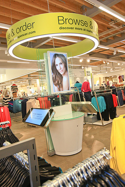
-
Opened on the 29th of August this eco friendly superstore has been in
the making for 2 years. This is M&S's second biggest store but its
greenest, boasting 30% more energy efficient, 35% carbon efficient and
uses 70% heat reclaim from fridges and the store itself.
- Introduced to Cheshire Oaks near Liverpool, with an architectural design that addresses several sustainability issues.
-
Not only is it the greenest store, but M&S are now advancing in
their use of technology. With use of 'Browse and Order' stations where
the customer an look through the online catalog of clothing or other
items and if they don't have the product within the store, they are able
to place an order ready for collection at a later date. Also the sales
assistants are armed with IPads for maximum efficiency and heplfulness
to the customers. There are booths with touch screen capabilities which
also allow you to have a virtual make over in store, to go along side
their new beauty section.
Topshop Collaboration- J W Anderson


-
J W Anderson is fast becoming a national treasure in the eye of Britain
with his eclectic quirky, preppy British and American style. The
latest collaboration with Topshop is a stroke of genius as both truly
epitomizes British Fashion. The collection they have created is all
round, fun and accessible to everyone on the market. This allows the
Anderson's pieces to be purchased by people from the high street and
creates more of a buzz amongst the UK market.
-
Anderson's collaboration was designed with his sister in mind. As
Topshop is one of the most popular leading fashion outlets in the UK,
with every teenage and twenty something girl regarding the shop as a
staple, its only natural that he created a line that adheres to that of
the fashion on the streets. Wearable, accessible fashion is key and the
concept is to create iconic pieces and not necessarily a whole
ready-t-wear outfit. This has become toe norm; to create and assemble a
mix match of different things and accessories to create something unique
and original.
- "For me, Topshop is integral to London Fashion Week," Anderson
told us. "It's everything that sums it up. I have worked on this
collection with my sister in my mind, because I wanted it to be
accessible. I feel like we are at a time where we want a fanfare;
something fun, accessible and easy. I approached it in the same way
I do all my collections. It was unique and has some really iconic
pieces. I wanted it to be the idea of what a JW Anderson store
could be."
- "I think that’s how a woman’s wardrobe really works now anyway, it’s not
about a flat-line head-to-toe look, it’s a grouping of different objects
and things."
Topshop and Facebook Live stream

- In a way Topshop is using the customer as a free advertising tool. By creating a sharing your own customised key looks, you are encouraging others to do the same ad purchase more of their clothing; also as the stream is live from collections that aren't available to purchase yet, it meant the customer had to order the item 3 months in advance. There is a slight element of impulse and pressure buying in this and also makes the whole experience a lot more exclusive and that of a high end fashion house.
- Topshop in its own right has made a real impact on British fashion and also London Fashion Week with its always eagerly anticipated shows.
Google Glass at NYFW


- '...the glasses themselves caused a major stir during the show, and
according to the Times, "the entire front row was trying to
simultaneously tweet images of Mr. Brin."'
-
Google Glass is an innovative creative design which harbors elements of
computer and smart phone technology. This head mounted display features
a tiny display, a camera 3g and 4g technology and is capable of
bluetooth and wifi.
-
The first final prototypes were showcased as Diane Von Furstenberg
joined forces with Google to promote the new glasses. Her models wore
the headpieces in the collections, however no input of her design was
put into these glasses, they were merely being showcased by her.
-
NYFW is one of the main fashion shows to take place and so there is a
lot of chance of publicity. Also many influential people sit on the
front row of these shows and have great influence over fashions, trends
and blogs. All of the front row were tweeting these instantly as they
were shown on the catwalk. This was a very big publicity stunt on
Google's part and it was a great idea.
-
It wasn't known if the headpiece was working with full capabilities,
but the camera was and a short documentary style moved, filmed by the
glasses is being put together for others to see.
Trend Prediction
The Future Laboratory

- "Via
our global network and in-house team of trend analysts and ethnographic
researchers, we offer clients qualitative and quantitative insights into
future consumers and how to target them. "
-
The Future Laboratory is design consultancy and trend-forecasting
company that also offers brand innovation and marketing advice. Founded
in 2001 and based in London, The Future Laboratory can and look 2-10
years in the future and predict the movements and trends emerging within
consumers. There are 15 staff on the team who offer this bespoke
research and brand innovation to help companies develop, rebrand and
prepare for the market in the future.
-
Its clientele include the BBC, L'Oreal, Unilever, Louis Vuitton, Sony,
American Express, Marks and Spencer, British Gas, The Body Shop and many
more.
- There are three different divisions within the company;
1. They offer an online trend forecasting subscription, 2. Commissioned market research called Future Poll, 3. Brand strategy and innovation.
1. They offer an online trend forecasting subscription, 2. Commissioned market research called Future Poll, 3. Brand strategy and innovation.
WGSN

-
WGSN launched in 1998 as a trend forecasting service for fashion and
design industries. They are the leading and most influential trend
analysis company and largest to all influential brands and businesses in
the world. Also now trend forecasting for Home and interior design.
WGSN use 3 key stages of trend forecasting- Input, which is all the
information they gather from researching behaviours, consumer, trends
etc, Analysis and Output- whereby they create the trend packages, colour
pantones, key items, silhouettes, styling or graphics.
-
300 editorial and design staff at hand to create trend packages, mood
boards, market analysis and consumer behavioral reports all over the
world in Europe, Asia, north and South America and the Middle East.
- WGSN's six inspiration zones offer unrivalled creative stimulus:
• Follow street fashion around the world
• Monitor trends in arts and culture
• Track celebrity fashion trends
• Discover the latest in pop culture
• Dive into vintage
• Explore inspirational photography portfolios
• Follow street fashion around the world
• Monitor trends in arts and culture
• Track celebrity fashion trends
• Discover the latest in pop culture
• Dive into vintage
• Explore inspirational photography portfolios
- Their clientele includes M&S, Next, Topman, River Island and Tommy Hilfiger.
Multi disciplinary, Objects, spaces
Aurelien Juner


-
Aurelien Juner is a French multidisciplinary designer living and
working in Barcelona. Art-Direction, Graphic-Design, Illustration,
Motion, Photography, Web design. "I like contamination between arts, mixed media, order & disorder, play and experiment with creative discipline."
-
In his most recent and famous series called Surface, Juner explores the
relationships people have with glossy highly regarded magazines. He
takes each magazine and applies a different medium to them, burning,
ripping, artistic creations, binds and distorts to create a whole new
meaning and make the audience think differently. Based on Mass culture,
he brings to attention the culture that idealises this universe and
makes them question the connections these magazines have to reality.
- "His photographic project Surface
is a personal reflection “on the function of the fashion magazine as a
medium of dissemination of mass culture images and [their] relation to
reality.”
-
In other works Juner has delvedJuner has delved into photography, paper
creations, illustration graphic design and also explorations into
typography.
United Visual Artists


- The United Visual Artists are a design and art practice group based in London and founded in 2003. Their designs include multi disciplinary works such as sculpture live performance, computer science engineering communication design ad moving image.
- "The cross-pollination of diverse skills inspires new fields of exploration, which is core to
their ethos."
- They have exhibited in the V&A Museum, South Bank Centre, Royal Academy of Art and many more all over the world. UVA's Speed of Light installation won the Yellow Pencil award at the D&AD awards.
- UVA;s designs for live performance have led to commissions at venues like Madison Sq. Gardens and Trafalgar Sq and collaborations with groups like Massive Attack on their live tours, Jay Z, U2 and Chemical Brothers.
Fred Butler


- Fred Butler is a prop designer who graduated from the University of Brighton in 2003 in fashion design. Whilst assissting Shona Heath, she decided that she wanted to get into Prop design. In 2006 she set up her own art director website showcasing her work as a specialist in props as accessories. She created props and accessories for stylists sucha as Nicola Formichetti, Patti Wilson and Lucinda chambers.
- Her clientele is prodominantly musicians the likes of Marina and the Diamonds, Patrik Wolf, Little Boots Sigur Ross and Lady Gaga. She designed the blue telephone hat which was used on the set of Telephone.
- Her style is extremely kitsch, eclectic, geometric and inventive. Her knowledge of pattern cutting and construction of garments went hand in hand with her innovative whacky designs. For her new collection named " A Bee in my Bonnet with a Honey Hair Comb" she has adorned and customised shoes, clothing and accessories in honey comb shapes and embellished with sequins and intricate embroidery.
Petra Storrs


-
Art Direction, Set Design, Prop Styling & Costume Design, for
Editorial & Commercial clients. She works in this spectrum of
mediums and is said to be one in 15 creatives who will define the future
arts in Britain. ( the independent newspaper.)
-After
graduating from Kingston university Storrs set up her studio in London
where she is working on a number of up and coming projects; She has an
on going collaboration with Singer Paloma Faith for set design, she has
worked with the likes of Lady Gaga, Selfridges the V&A, Florence and
the Machine on commissioned work. She has also worked for editorial
clients such as Elle, Wallpapaer magazine, Boots, Evans the Creative
Review, The Sunday Times RSA Films and many more.
- Her inspirations include: "The Egyptian, The Greeks, The Romans,The Renaissance, The 20s, 30s, 40s,
and 50s really any time period with a bit of glamour, beautiful forms
and colours and architecture, everything was so well made and so much
time was spent making things perfect."
Tim Walker


-
Tim Walker, as well as being known as a world famous photographer, is
also a visionary in set design. Firstly thinking he was going to become a
stylist or a set designer, Walker had found he had a keen attention to
detail, a great creative eye but not much technical love for his camera.
Nevertheless he pursued his career in photography and also managed to
keep the creativity, extravagance and ambition in the sets he creates.
Magazines
Dazed and Confused


-
British style magazine set up in 1992 by Jefferson Hack and Rankin who
is now a world reknowed photographer through the works of his beautiful,
colourful and striking images of celebrity portraiture.
-
The magazine features film music fashion arts and literature and
although it began as a small black and white folded poster, it soon
turned into a full colour magazine publication with help from the London
club scene.
-
Jefferson Hack's eye for emerging scenes and talent proved to be a
stoke of genius and the magzine soon gained a cult following and created
it into one of the household names of the country and most influential
magazines.
-
Dazed has leapt into the digital age at sprinting speed by creating its
online version of the magazine Dazed Digital. All the information from
the magazines are stored along with much more insightful interviews,
blogs, comments and opinion and interactive media to make the whole
Dazed experience that much more. They have also launched Dazed film and
Tv which is a production company and Dazedtv.com where they showcase
fashion films interviews and documentaries on up and coming talent.
Dazed is now a lifestyle.
-
Many famous celebrities have graced the front cover of Dazed such as
Eminem, regular Bjork, Kate Moss, Jarvis Cocker and Radiohead.
Dazed and Confused is one of the most current and influential magazines in the UK today and I really admire that this magazine is as well known and inspirational today as it was in the 90's. Again employing the most influential photographers and stylists in the field today makes the content ahead of its time, this also applies to the fashion and the models they use too. Much like i-D however, I must say that I am not drawn to reading the actual magazine and on first glance for some reason I feel that I would be bored with the information, which, of course, is not true! The images however guide your way through the magazine and give you an inclining on interviews, culture or music. And this is the key element in these arts and culture magazines- the photography that is innovative and original.
i-D


-
British magazine dedicated to fashion, music, art and youth culture.
founded by former art director of Vogue in 1980 Terry Jones pioneered
this small fanzine into a glossy magazine.
-
The main focus was youth culture and street style and every issue did
and still does centre around it. This is the reason why this magazine
has stayed fresh, innovative and young; it adheres always to whats going
on in the subcutures and o the streets. This is where fashion is at is
rawest and most original.
- i-D is known for its innovative photography and typography and use of established photogrpahers such as Nick Knight, Wolfgang Tilmans, Juergen Teller and many more and their amazing skills ans creative with their photography has influenced a whole generation of followers and makes the reader want to come back for more.
- i-D is known for its innovative photography and typography and use of established photogrpahers such as Nick Knight, Wolfgang Tilmans, Juergen Teller and many more and their amazing skills ans creative with their photography has influenced a whole generation of followers and makes the reader want to come back for more.
-
One of the most famous trends that i-D had pioneered was the "Straight
Up" style street style photography. Much like every fashionista of
today, a photographer would go out into the streets and take head to toe
pictures of fashionable people who were in interesting ad creative
outfits.
-
The i-D logo is also always mistaken for the word identity, but really
its a winking face on its side and all the models that are on the cover
are always winking with one eye. This magazine has become iconic in
Britain hailing it the most current and on trend essentially British
style magazine.
Although I-D is one of the UK's most popular magazines, if i were to buy it , it would only be to look at the shoots and images. With this style of layout, I am never drawn to reading the actual article and most of the time (whilst looking at the pictures) I don't even now what the story is about! This is because i feel that the design is slightly overwhelming with blocks of small text- this doesnt make it appealing to read. However from a design eye point of view, the graphic designers are trying to create text into a visual image, by use of text. Instead of the content being the most important thing in the magazine, the aesthetic look is key. However, the images are breathtaking and always captivate me.
Although I-D is one of the UK's most popular magazines, if i were to buy it , it would only be to look at the shoots and images. With this style of layout, I am never drawn to reading the actual article and most of the time (whilst looking at the pictures) I don't even now what the story is about! This is because i feel that the design is slightly overwhelming with blocks of small text- this doesnt make it appealing to read. However from a design eye point of view, the graphic designers are trying to create text into a visual image, by use of text. Instead of the content being the most important thing in the magazine, the aesthetic look is key. However, the images are breathtaking and always captivate me.
Ponystep


- London based Bi-annual print and online publication found by Richard Mortimer. This publication only in its 3rd issue, has already attracted quite a loyal fan base and influential following.
- Stellar list of contributors to the magazine with the likes of i-D contributors, Solve Sundsbo, Danie Jackson and photographer Alice Hawkins.
- Its tongue-in-cheek attitude and glossy fun photography have proved very popular and created a cult following also with high profile influential celebrities such as Kylie Minogue, Jerry Hall, Amir Kahn and Janice Dickinson.
- These celebrities are meticulously chosen, not according to whats the hottest trend right now or who is the most popular, but by how influential they are, mostly in Richard Mortimer's life. People who inspire and to celebrate the outsider.
I like the style and layout of Ponystep magazine, as its lends its style to the gift of white space and graphic design. The creative and artistic direction is bold colourful which creates visually captivating pages. I am always drawn to colour blocking whether it be bold or muted and the lure of white space. It always provides an almost blank canvas that urges your brain to fill in the gaps.
Fresh Faced and Wildeyed 2012, The Photographers Gallery

 With
an unique style of photography duo Daniel Evans and Brendan Baker are
fast becoming popular in their field. Mainly being commissioned for
fashion, they have worked with J W Anderson's new collaboration with
Topshop, Dazed and Confused, ID magazine, Wonderland and Wallpaper
magazine.
With
an unique style of photography duo Daniel Evans and Brendan Baker are
fast becoming popular in their field. Mainly being commissioned for
fashion, they have worked with J W Anderson's new collaboration with
Topshop, Dazed and Confused, ID magazine, Wonderland and Wallpaper
magazine.
 I
really loved this photographer's work; they split family photos,
normally of children in two horizontally and rearranged them in such a
fashion that the heads and bodes were on different people, but matched
up quite perfectly. It was a strange idea that developed beautiful
results. I could have stared at these for hours.
I
really loved this photographer's work; they split family photos,
normally of children in two horizontally and rearranged them in such a
fashion that the heads and bodes were on different people, but matched
up quite perfectly. It was a strange idea that developed beautiful
results. I could have stared at these for hours.


 These
also were really fascinating pieces that were truly voyeuristic. These
macro shots of the insides of bread and tomato, with careful lighting
and angles, the photographer was able to create beautiful other worldly
images. Looking like magical caves, with strange textures, these images
were extraordinary and bold, bright pieces.
These
also were really fascinating pieces that were truly voyeuristic. These
macro shots of the insides of bread and tomato, with careful lighting
and angles, the photographer was able to create beautiful other worldly
images. Looking like magical caves, with strange textures, these images
were extraordinary and bold, bright pieces.


-
Fresh faced and Wildeyed showcases the work of recent graduates in the
UK. Started 5 years ago in 2006, The Photographers Gallery creates a
platform for graduates and fresh talent to aid and nurture their talent
in order to help launch and establish long lasting careers in the
industry. 


- Graduates normally have an array of experimental, fresh and new approaches to their work.The prize is:" A number of mentorships will be awarded to finalists, who will be matched with a mentor whose professional/ creative background is relevant to their practice. The mentor and graduate will enter into a yearlong dialogue, offering participants invaluable feedback on their current work and the broader professional and critical context into which it fits."
POP! Fashion and Textile Museum


-
This exhibition explores the 1950's Pop culture, which was brought in
by a new wave of Rock n Roll and youth culture from America. The
combination between art, fashion and music changed the way people
dressed, acted and thought.
- Personalities within music became like idols.
Everything they did, wore and sung was copied by the youth. People like
The Beatles, Elvis Presley and Elton John were amongst the most
influential people of the time, defining a new generation and
subculture.
Class Task
Graphic Design Introduction - Basic Layout
Today
in class we were given a newspaper in which we had to cut out a small
piece of text, a picture (full size and small) and a title. Then we had
to play around, with the help of a grid, and see what different kinds of
layout we could create. This was the first step in helping us
understand the basics of visual communication. Graphic design is all
about the way we visually communicate words and images on a screen or
page, as this is the initial thing that a person looks at. Someone's
first impression is the key to determining if they want to read about
the advertisement or article. If the page looks visually stimulating and pleasing to the eye, that person is more likely to carry on reading.
So
the once we had completed the newspaper task, we transferred these new
found skills onto InDesign. Having had previous experience in InDesign
before, I found the task quite easy, but I knew about the whole grid
system before, but had never really been taught what it meant and how to
use it, so after that hands on task I was able to create things more
visually on screen. It has really opened my eyes up to graphic design,
initially I had been quite scared to create layouts and had no clue how
to go about designing a page. However now with even the most basic of
knowledge, I gave it a shot and found it to be quite interesting. I
found that simplicity is the key and a style i have always been drawn to
whether it be in my actual style and styling or my illustrations, so
this came as a natural progression for me.


For
the research task we have to create an 8 page editorial or artists and
people who influence and inspire our work in the fields of chosen study.
During this lesson I have already a few artists and stylists in mind;
Kelly Smith (illustrator)
Stina Persson (Illustrator)
Jessica Durrant (Illustrator)
Rebekah Roy (Stylist)
I
have chosen to research into fashion illustrators and stylists as I
believe these are the areas of most interest to me. I also want to
research into photo editors and manipulators, but am not really sure how
to go about it. This is because when you search something in google it
comes up with freelance professional editors such as skin retouching etc
and not the people who actually artistically create and manipulate
photographs from shoots. One of my passions and a skill I have is
Photoshop. I love testing out different effects and also photography
effects to create more artistic and creative shots.
Maybe
as the course goes on I can explore this area in more depth, but for
now I think I will focus more on Illustration and Styling as my key
paths. With it also being a one week project, it is a lot of research
and sketchbook work to fit in. Even though the task in itself could be
completed in one day, the longest part is researching the right images
(size, quality and relevance), the correct inspirational people and not
to mention the multitask process of developing your ideas whilst
simultaneously documenting it within a sketchbook AND blog.
TYPE
SERIF
Serif is a latin word basically meaning the 'curly' bits on font. In the olden days when type was handwritten, they used serifs in order to make the letters and words more legible because the quality of paper was so bad. Nowadays it is still used and gives and old fashioned, heritage style to a font. Brands such as Burberry use serif in their logo to maintain that sense of antique.
SANS SERIF
Non serif is the basic translation from latin. It means that the letters do not have serif and are of a functional form, without any decoration.
Within this magazine layout research I want to explore the relationships between image and text, and the style of the magazine according to demographic. I shall research various magazines that have different ethos', sizes, audience and layouts. Then from this research I will create my own layout based upon the things that impress me/ inspire me.
Having previous experience in InDesign, this is a nice task to get back into designing on it. However, as i said before, I have wrapped my head around graphic design a little bit more. Having never had much experience in it before, Chris has put the whole process into perspective. The thing I found most effective was putting all the parts onto the page before hand to see what components I had to work with. This will definitely help me with the production of this 8 page layout.
Progress
I have two days left to complete this project, and whilst a week definitely isn't long enough, I have completed all of my research for my 8 page editorial! The next stage is going to be filtering down three main inspirations from both illustration and styling to add into my editorial. I don't want to overwhelm too much information and artists so I think three is a perfect amount. I have decided to include some of the sketches I have done based on a few of the artists to show my progression and development as an artists whilst looking at these people. The first image is based on the work of Niki Pilkington with combined use of coloured pens of vivid colour and graphite sketch. I focused a lot on very dark shading, using the 7B sketching pencil for the dark areas. The picture I was referencing was from Dazed and Confused, an advertisement from Guess. I haven't sketched in a long while so was really please at the results of the drawing.
Having downloaded InDesign, I am now starting to put all the images and parts of text into the document. I rang the printers and they said the document needed to be handed in for 2 O clock, so i have been almost rushing to meet this deadline. However I rang them again and they said it didn't matter when it came in as long as it was before 5.
Having completed the design of my pages I am quite pleased and impressed by my forced ability for laying things out. I was always intimidated by the white space, wondering where to start, where the first images would go and if I had too many things on one page. Upon reflection, if you have all the necessary components ready before you start laying out, it will be to your advantage greatly. I decided on the main images I wanted to portray and wrote all the text in word before.
3 Week Project
We were given a three week project to come up with any concept that relates to the fiedls in which we are interested in. I was talking to my course mate Lucy Gilbert about collaborating in the future and we decided that, as we are interested in similar fields ( styling, make up, magazine creation), that we should combine the different ideas we have to generate an amazing project. Also as we have different skills to bring to the collaboration, Lucy has photography skills and her style of post production and styling, and I have my Styling hair and make up background along with my interest in illustration and post production. Lucy is more used to styling menswear and has a gritty, realness to her photography, whereas my style is more feminine, simple and graphic like. The combination of the two could create something really interesting and contrasting so I am really looking forward to collaborating with her.
Firstly
we discussed what kind of things we would be interested in creating and
we both like the idea of making a mini zine or a look book comprised of
photo shoots either inspired by street style of a current trend that
interests us. And then we met up early Monday 15th October to discuss and combine our ideas and came up with a different way to showcase our work.
I brought in inspirations of ink blots, new wave gothicism and a kaleidoscope type design, Lucy was thinking along the same line with the dark, grungey theme and suggested we design graphic prints for men's t-shirts. As I had never done anything like this before, I thought we should go for it and push myself out of my comfort zone.
I brought in inspirations of ink blots, new wave gothicism and a kaleidoscope type design, Lucy was thinking along the same line with the dark, grungey theme and suggested we design graphic prints for men's t-shirts. As I had never done anything like this before, I thought we should go for it and push myself out of my comfort zone.
From this meeting we then agreed on our colour palette for the shoot and the style in which we were going to shoot in. Taking the black/blue hues of the ink blots we thought that neon green/yellow would be a great complimentary colour, which is very on trend right now. Also a deep magenta colour would compliment these two nicely too. The photo shoot however we wanted to shoot in black and white with a grainy kind of filter. We were drawing inspiration from Victorian photographs, which are quite creepy, coffee stained and scratched.
Our
first thought was to take the pictures on film so that we could
illustrate and scratch the actual film, but just in case we decided to
take on digital slr so that we can combine illustration rather than ruin
the film.
With
all of these ideas in mind, we went away to create moodboards for
styling, make up , photographic style, inspiration and analyse the
research we had ready for our tutorial on Wednesday.
Wednesday 17th October
Tutorial.
Lucy
and I decided to come in early to show each other our sketchbooks and
developed ideas so we could finalise a concept to show Chris. We decided
that we wanted to produce a series of illustrative photographs that
will be printed on Men's T-shirts with a lookbook/concept book to
support the theme and mood of the brand/t-shirt designs.
Upon
taking this idea to Chris, he said that he really liked it and showed
us a few exhibitions, museums and shops based around taxidermy that
would really influence our work. Also he told us about the new wave of
gothic house music called Witch House that is a real emerging
underground sound. We listened to a few tracks of this genre and really
like the chilled out, eeriness of it, and I could imagine it playing at
the launch of this brand.
After establishing what exactly were were going to do, and because we are doing a collaboration we have to differentiate the parts in which we are involved in, so that it is easier to be marked.
Following
the tutorial, Lucy and I then went to the Library and planned out a
time sheet and planned when we were going to shoot, print and source
garments and outfits. Tomorrow, (thursday) we are going to a few
exhibitions in London for inspiration and Camden in order to source and
buy props and garments to shoot for our look book.After establishing what exactly were were going to do, and because we are doing a collaboration we have to differentiate the parts in which we are involved in, so that it is easier to be marked.
http://www.nikyniky.com/so2-music-video/
Subscribe to:
Posts (Atom)